

These are my takes on alternate Sync logos for Lemmy (I made that rat from a while ago)
The logo for Sync is so tied to Reddit for me personally, that it was hard to think of ways to translate it to Lemmy (or the Fediverse overall).
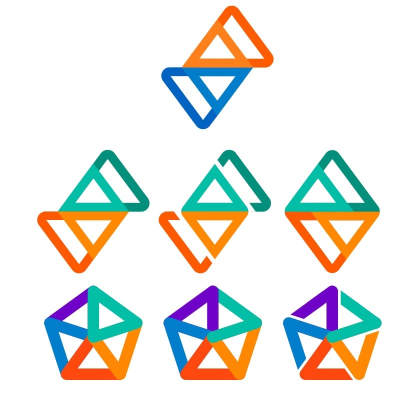
Orange and Blue are signature colours for Reddit, but Lemmy doesnt necessarily have a colour scheme. Nor should it. that’s up to the instance operators to choose, making their community unique.
I also like the general Fediverse pentagon logo, but it can look quite busy…
I did what I could. I’m an average designer at best ¯_(ツ)_/¯
You must log in or register to comment.
Uh, ignore the pride-themed swaztika with an extra arm
😂 I actually like it 😭
do you want to become an artist aswell?
Follow-up question: what are your thoughts on respecting the sovereign borders of Poland? Art school admissions must be a stressful job
LGBTQanon logo
I like the middle Fediverse logo. The bottom right one is a little swastika-y.
Middle is cleanest, the separation of the top right and bottom left elements makes it very readable.
Why not just keep the original one? There’s no reason for people to keep the Reddit app installed anymore
It’s about the symbolism of the color change, the fresh start
The current version with reversed colors, is all that’s needed. I wouldn’t change it beyond that.
I thought that too, that makes the most sense honestly.
I just thought it’d be fun to fiddle with the logo
I really like the middle one.
Pretty good. If you don’t want to do it, send me the images so I can fix the banner and icon, because I didn’t spend enough time on the icon cleanup.
middle right or bottom left. the other 2 bottom ones give off some old germany vibes of not happy times


