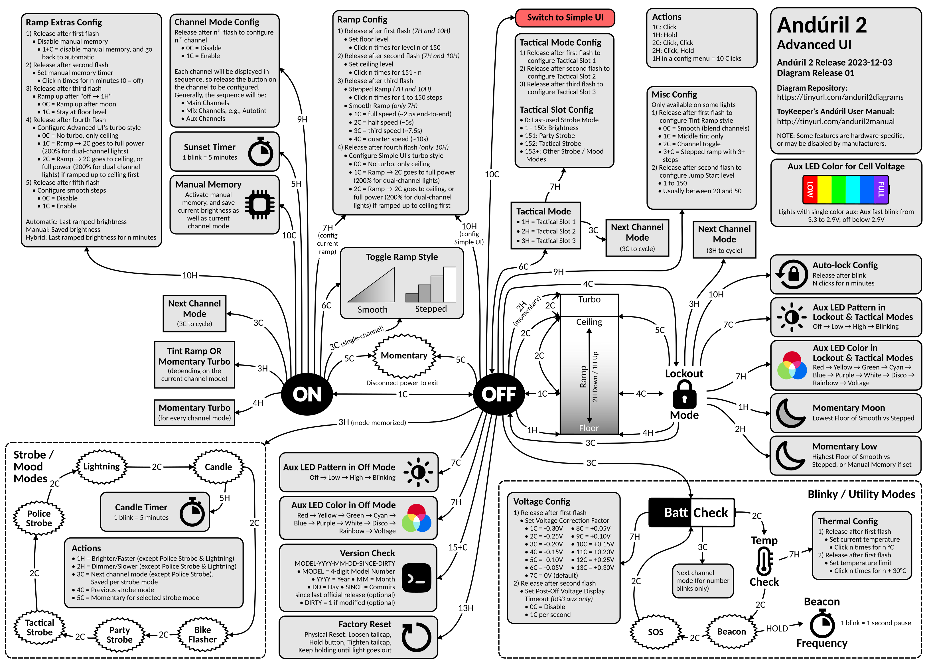
Advanced UI
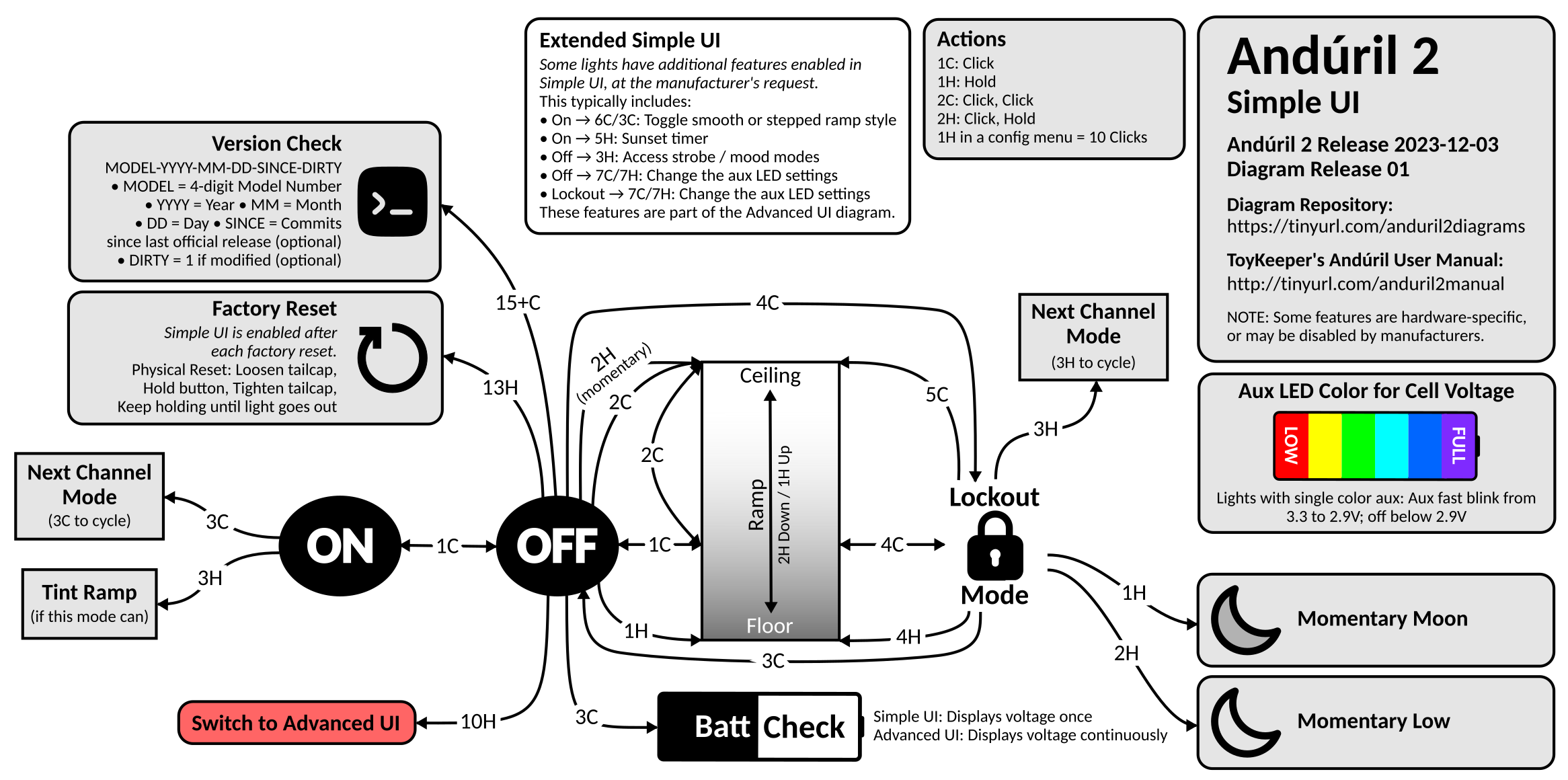
Simple UI
Background: This was 100% inspired by Lux-Perpetua’s Andúril 2 UI diagram on BLF. In fact, Lux’s diagram is so good, that I would have been happy to just use it except for one thing: the source isn’t published, so you can’t modify it. I also wanted to be able to keep it up to date with u/ToyKeeper’s code. So I created my own…
This is where I intend to store all of my Anduril 2 UI diagrams, and any updates to them. Since ToyKeeper split off the multi-channel version of Anduril 2, I have created two new diagrams for it:
Anduril 2 Multi-Channel Advanced UI (PNG)Anduril 2 Multi-Channel Simple UI (PNG)
Diagrams now hosted on GitHub.
Yeah, it got complicated enough that I could no longer fit the Advanced and Simple UI diagrams on a single page, so I had to split them.
As always, you are free to do whatever you want with these diagrams. I make these for myself, and I’m happy to share them with the community. You can find the source MS Visio file here. Feel free to make your own copy and modify it to your heart’s content. The Visio file contains several pages:
Single-Channel - Advanced/Simple UI diagram for the single-channel version of Anduril 2. I still need to update and post it.Multi-Simple - Simple UI diagram for the multi-channel version of Anduril 2.Multi-Advanced - Advanced UI diagram for the multi-channel version of Anduril 2.Diagram Parts - Various bits and pieces that I use in the various UI diagrams.
If you find any errors, please post a comment here. I try to keep the diagrams as accurate and up-to-date as possible, but you know, life happens. Enjoy!
Updates:
- 2023-07-06: Fixed several issues pointed out here. Thanks @lowprofile!
- 2023-07-09: Fixed a few more issues pointed out here. Thanks again @lowprofile! Also trying to get the wording in a few places more inline with the text manual.
- 2023-07-15: Updated for r728 which added channels for red, yellow, green, cyan, blue, purple, and white. Added 4H from ON to Momentary Turbo. Added 3C from Tactical Mode to Next Channel Mode. Several other minor fixes. Huge thanks to @lowprofile for continuing to provide valuable feedback. This multi-channel diagram has been a journey!
- 2023-07-17: Multiple visual enhancements/fixes thanks to @lowprofile. Incremented the version to r732 even though there were no material impacts to the diagram.
- 2023-07-20: Modified the ramp part of the diagram to reflect the default Anduril 2 configuration (2C to Ceiling). Thanks again to @lowprofile for feedback. I also switch from revisions to build dates as suggested by ToyKeeper.
- 2023-07-22: Made several corrections to the Simple UI diagram that I had been neglecting. Also made a slight wording change to the ramp config boxed on the Advanced UI diagram. Thanks to @lowprofile for all corrections. Finally, I incremented the build date to 2023-07-21, although there were no material impacts to the diagrams.
- 2023-08-06: Several cosmetic fixes to the Simple and Advanced UI diagrams thanks to feed back from @lowprofile. Also incremented the build date to 2023-08-04, although there were no material impacts to the diagrams.
- 2023-08-07: Several clarifications thanks to feedback from @lowprofile. Also incremented the build date to 2023-08-07, although there were no material impacts to the diagrams.
- 2023-08-10: Several cosmetic fixes to the Simple and Advanced UI diagrams thanks to feed back from @lowprofile.
- 2023-10-03: I’m embarrassed to admit that I missed an update from the 2023-08-27 release in which “smooth steps” were added (see the Ramp Extras Config). Other than that, there have been no material changes to the diagrams.
- 2023-11-07: I finally got around to making a couple of updates suggested by @lowprofile. In the Strobe Modes on the Advanced UI diagram, you’ll notice that 3C allows you to save the channel mode per strobe mode. Very cool!
- 2024-01-01: Last update here on Lemmy. Lemmy is great, but it makes more sense to host the diagrams on GitHub when I can issue diagram releases corresponding with ToyKeeper’s Anduril 2 releases. From now on, please access the diagrams there. It’s a fairly significant update, so please be sure to read the README.
Here are some additional details:
-
Advanced UI: In Strobe Modes, Actions,
3C: Next channel modeis not a function for Police Strobe (which makes sense, as Police Strobe uses more than one channel on its own), so it could read3C: Next channel mode (except Police Strobe). -
Advanced UI: In Strobe Modes, Actions, instead of presently
4C: Previous mode, it could read4C: Previous strobe mode, to clearly distinguishstrobe modefromchannel mode. This wording would also be in line with the text manual. -
Advanced UI: In line with #2, in Strobe Modes, Actions, instead of presently
5C: Momentary for selected mode, it could read5C: Momentary for selected strobe mode. -
Simple UI: As an idea, maybe it would be useful to add two lines of information below (or next to)
BattCheck, Line 1:Simple UI: once, cf. text manual, and Line 2:Advanced UI: continuously. This distinction can serve well in determining whether the current UI is Simple UI or Advanced UI, even the more so with the recent developments in hank-cfg.h, where the modified Simple UI now allows ramping toggle as well as aux config and strobe modes.
Fixed all. Might be a little wordy on #4, so let me know what you think. I think it’s a really useful add, and I wanted it to be clear. Thanks!
All looking very good to me, thanks! #4 is very clear this way, and suitably located.
-
I also wanted to be able to keep it up to date
thanks for all your efforts, very helpful
fwiw, I just received an Emisar D2 and did a version check that resulted in:
2021 12 13 0135
it uses 3H to change channels, not 3C…
I am trying to learn to reflash the D2 to a later version, but have not figured it out yet. I also dont know which hex file to update to, yet. update, found it: http://toykeeper.net/torches/fsm/anduril2/anduril.2023-04-25.emisar-2ch.hex
Do you have a flow chart for the existing stock firmware on the D2? (I dont know what revision that would be)
Unfortunately, I have not been keeping historical versions of the diagrams. I checked the file on Dropbox, and it only goes back a month (to a July 9th version of the diagram for r725 which still uses 3C to change channels). Someone once suggested that I use GitHub to track changes for things like this, so I may look into it in the near future.
I don’t have a D2, but I believe that it uses the same firmware as the D4V2 dual-channel. This would be the latest version from earlier this week (08/07). Once you get on the latest version, my diagrams should apply.
This would be the latest version
saved, thank you very much for all your help ;-)
Idea for the initial post (showing on top): Maybe it would be useful to also have the diagram (PNG) for Simple UI show up? As far as I can tell, there is one image that can function as a thumbnail at the very top (should probably just stay the Advanced UI PNG, as presently), but maybe in the text below, either the Simple UI PNG or both, Advanced UI PNG and Simple UI PNG, could be displayed (displaying both underneath each other would show them together and make clear that they belong together; and Anduril novices might want to start off with the Simple UI diagram and could see that one right away). This way, the Simple UI diagram would get more and immediate attention as well.
This is going to sound silly, but I didn’t realize that I could post in-line images. I added both per your suggestion, and it’s much more functional. Thanks for getting me to finally look into it!
Awesome! (and nothing silly here) :-)
Some further details:
-
Advanced UI: Layout detail: For consistency, the new additions to Ramp Config, three times “(7H and 10H)” and “(only 7H)”, should probably be written in italics as well, just like “(only 10H)” at the end.
-
Simple UI: Layout detail: It caught my eye that with
13Hon the arrow to Factory Reset, theHis visually very close to the (4C) arrow line to the right of it. Possibly, this13Hcould be moved slightly to the left? This is the only visual instance like this that caught my attention. -
Simple UI and Advanced UI: As an idea, possibly a link to the diagrams, at present
lemmy.world/post/1038159, could be added, so everyone could easily locate the current diagram revision. A place to put this link as an extra line could be below theDiagram Revisionline in the Anduril 2 “bubble”. To maintain the “bubble” size, maybe a little smaller font size(s) could be used at the top; furthermore, as the multi-channel and the single-channel branches apparently are going to be merged, there might soon be no need anymore for theMulti-Channelspecification, opening up some more space in the Anduril 2 “bubble”.
All excellent suggestions as usual. I’m updating the diagrams now.
All looking great, thanks!
-
Question/suggestion: If not too much hassle (I am running Linux, and I am not familiar with MS Visio), would it be possible to add a .pdf version of the diagrams below the .png versions?
The .png files are high resolution and are great esp. for on-screen viewing, but for printing, esp. in larger formats given the diagram complexity, .pdf will still be more suitable than .png.
Actually, this could be one single .pdf file with 2 pages, one for Simple UI and one for Advanced UI, and this .pdf file could then be printed double-sided, or one specific page only, as preferred.
Just added a PDF link. Let me know how it works out for you.
Thank you very much for adding the .pdf version!
Unfortunately, as far as I can tell, there are several issues with the .pdf version that would need to be addressed, and I am not sure if that is worth the trouble, as this could turn into a project of its own. :-)
Obviously, it would be fantastic to have a source file from an open source, cross-platform software, so everyone could modify it as needed, and export/print it as needed. But that is a different topic.
Some thoughts:
-
First off, as expected, the font print is very crisp in the .pdf version, and as there is much text, that is great. But several graphic elements apparently are pixel graphics and do not scale cleanly (.png is a raster-graphics file format based on a pixel grid; this is for example also why the newly added link to the diagrams cannot be marked and copied from the .png version, but it can from the .pdf version).
-
Then, for some reason, there is a frame around both diagrams, and when printed with this frame, the diagram size shrinks, as opposed to the established .png version, which makes the .pdf version less readable. Moreover, the Simple UI .pdf version only appears in a small size in the upper right corner, instead of being displayed on the entire page.
While these issues might be addressed easily, I am not familiar with MS Visio, and there might be tricky details involved. Therefore, for the time being, I would suggest to remove the .pdf version again and to just go ahead with the established .png versions. These are high resolution and can also be printed just fine (although not as clearly as in .pdf format), and they are great for on-screen viewing and editing, so they already cover a wide range of use cases on their own.
Thank you very much again for all your efforts!
I originally saved the file as a PDF in Visio, and as you noted, the results were not good. Then I tried printing it to PDF in a couple of different ways, and I think the result is much better. Take a look at it again, and let me know what you think. The Simple UI diagram will always be smaller because that’s how the source is. When Visio saves it to a PNG file, it chops it down to just the canvas size needed for the diagram. Then when you print it, it gets enlarged to cover the whole page.
Thanks for the update! I checked the new PDF version, and I have to say that I am still not convinced.
The frame is gone now, which is good, but the diagram size appears to have remained the same. Simple UI is still quite small and located in the upper right corner only, just as you stated, but also Advanced UI is (still) not centered on the page, but is located somewhat low; this results in not being able to have it scaled to the largest possible size when printing.
I guess that both diagrams would need to be scaled to and centered on the respective page in MS Visio before exporting/printing as PDF. Maybe the PDF format is not a strength of MS Visio in general? In any event, this probably would require an extra effort with each new diagram revision, depending on how MS Visio is handling this.
Furthermore, the graphic elements in the PDF version appear smoother on-screen now, but when printed, they still look pixelated, actually more pixelated than in the printed PNG version.
So, for the time being, I would still suggest to keep on going with the established PNG files exclusively.
Yes, maybe if I had Adobe Acrobat Professional, I might be able to produce high-quality PDFs. But the cost is insane, and I just haven’t had a need for it. Perhaps I’ll have better results if I can ever get the diagrams switched over to an open-source alternative for Visio.
-
Apart from the “smooth steps”, there has since been one more material change: the channel mode for the strobe modes is now individually saved per strobe mode. This allows to set a different channel mode for each suitable strobe mode.
This change was introduced with revision 753, 2023-08-24, and documented in the text manual with revision 783, 2023-10-12.
I have checked with Emisar D2, running ToyKeeper’s latest release, anduril.2023-10-01.emisar-2ch.hex, and indeed, the channel mode is saved per strobe mode. So this is working.
This would be an addition to the Advanced UI diagram: “saved per strobe mode” could be added in Strobe Modes Actions 3C, which could then for example read
3C: Next channel mode (except Police Strobe), saved per strobe mode.In addition, here comes a slight detail for consistency in the Advanced UI diagram: in Blinky/Utility Modes, it should maybe read
Thermal Configinstead of currentlyThermal Configuration, as everywhere else in the diagram, it readsConfig.Thanks. I finally made the updates.
Great, thank you!
2023-12-03 is last release of @ToyKeeper. I’m testing it in FW3X and Turbo style is only in 10H menu and not in 7H (4 flash). I don’t remember if it was in previous version. Is redundant menu or maybe some flashlight has this double function?
Hi, I just checked with Emisar D2, running the lastest release 2023-12-03, and all is working as displayed on the diagram. From
ON, 10H leads to Ramp Extras Config (forAdvanced UI), with 4 Turbo style setting. FromON, for 7H there is no 4 Turbo style setting. FromOFF, 10H leads toconfig Simple UI, and there is 4 Turbo setting (forSimple UI). There is no redundant Turbo style setting, as one is forAdvanced UI, and the other is forSimple UI.Maybe some confusion is caused because both 7H from
ON(config current ramp) as well as 10H fromOFF(config Simple UI) lead toRamp Config, but this way, some space can be saved on the diagram page layout, because there is no need to display two separateRamp Configtextboxes. InRamp Config, after 4 Turbo style setting, in the diagram(only 10H)is displayed, indicating that this setting is only forconfig Simple UI, 10H fromOFF.I am hopeful that this addresses the issue, and may have clarified things. :)
deleted by creator
Thank you for the new upgrade!
these flowcharts are just fantastic!
thank you very much for sharing them
I have started using them, marked up with the specific changes I make to different anduril lights I own, like this one for my Aluminium TS10’s:
https://i.imgur.com/YH8Eh5A.png
makes it really easy to keep track of changes I make to the factory defaults
I nominate this thread to be a sticky… Thumbs Up!
Yeah, there are a couple of things I’m working on (very slowly):
- I’m converting the diagrams over to Inkscape from Visio for a couple of reasons: 1) Folks don’t have to buy a license for Inkscape since it’s open-source, and 2) Inkscape saves the diagrams to the SVG format which should allow folks to scale them up and down without losing resolution.
- I want to use version control on GitHub so that folks can select the version of the diagram that goes along with the version of Anduril they have on their lights. Not everyone has the ability to flash to the latest version.
It’s a slow process because I’m using Inkscape for the first time and I’ve just been busy. But any updates will always be posted here.
Thank you very much for the last update!

