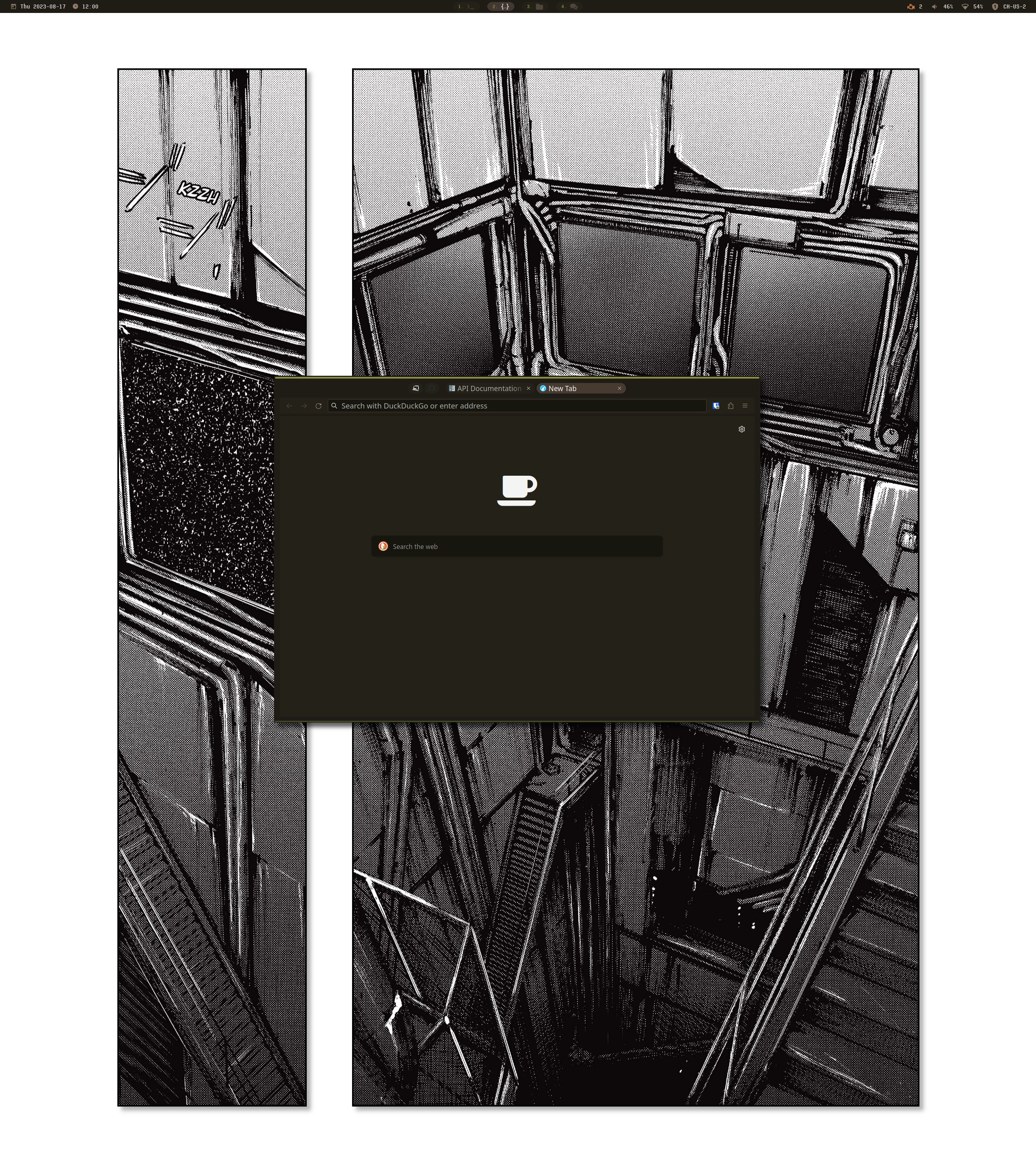
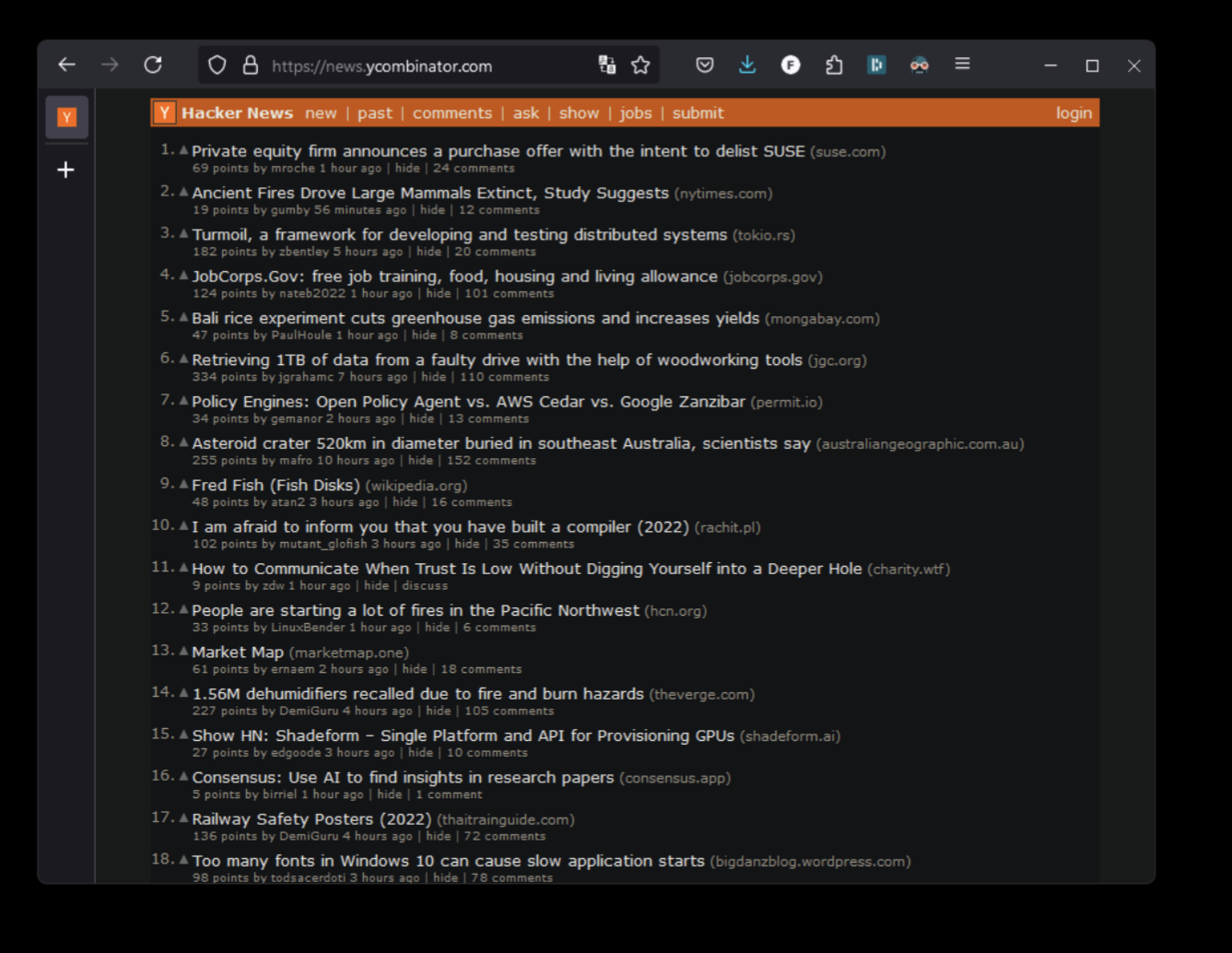
Was tinkering with userchrome and sidebery this day and it got me thinking how others has their firefox customized. Let’s bring the fun back to firefox. Share your screenshots. :)
I used sidebery and edited the userchrome.css using guides from r/FirefoxCSS
here’s some guides for them:
- https://www.reddit.com/r/FirefoxCSS/comments/rmi8dg/yet_another_sidebery_setup/
- https://superuser.com/questions/1268732/how-to-hide-tab-bar-tabstrip-in-firefox-57-quantum
But for reference, here are the codes for them (since Reddit appears to be down at the time of this writing)
Here’s the sidebery link on github
https://github.com/mbnuqw/sidebery
Note, to find your firefox profile folder:
I like that sidebar , how do you do it? Good looking Firefox!
Seconded!
In case you didn’t see: https://lemmy.world/comment/2503978
In case you didn’t see: https://lemmy.world/comment/2503978
Minimal. Matches my terminal theme.

Sleek and beautiful. And judging from that desktop, you’ve got a pretty big monitor.
Thanks. The monitor is an LG DualUp. It is the best productivity monitor I’ve ever owned. So much that within 3 weeks of buying one, I had to buy a second.
Speaking as someone who’s mostly on a laptop screen, that thing is big. When at home (which doesn’t happen a lot these days), I connect my laptop to a more modest Xiaomi 1C Monitor 23.8 Inch. I am not a techie so I’m not sure what I can use a vertical monitor for though.
It’s like two regular horizontal 24in screens on top of each other.
Why is there a SEARCH bar next to the bar where you can search anyway? How did you get that bar on the left with icons?
Why is there a SEARCH bar next to the bar where you can search anyway?
i can think of a few reasons
Reasons to Re-Add Search Bar in Firefox Benefits and Explanations Quick Access to Multiple Search Engines Easily switch between different search engines for different purposes. Separation of Functionality Avoid accidental searches in the address bar. Visual Preference Keep the interface structured and organized. also privacy issues with sending every keystroke in my address bar to a search engine
You can switch search engines through the address bar too.
i remember, you can use prefix searches @ddg or similar … just redoing a query on different engins was bothersome, since you needed to jump back to the beginning or click on the icons. in the search bar, i can just ctrl+k to focus the search area again and use ctrl+arrowup/down to toggle the target engines quickly.
edit/correction: my mistake … the arrow toggle also seems to work in the url bar. Re-Checked in a new profile, since i normally dont have it enabled. So i guess you can ignore that point on my list. Sorry.
But i guess you can still more easily change to another search engine and have it set for as long as you want. since the search area remembers/keeps you selection … i dont think the url bar remembers your last used search engine and always jumps back to the default, if you dont explicetly change it again.
Why is there a SEARCH bar next to the bar where you can search anyway?
Muscle memory I guess. I associate the main bar with typing in websites. While the smaller one for search. That’s how I’ve been doing it for years.
The icons are pinned tabs using sideberry and CSS from r/FirefoxCSS
I installed that Sideberry, pretty neat.
My UI isn’t really customized, as I prefer it as clean and bloat free as possible to maximize the space for actual content. Like that extra search & side bar and all the icons are something I’d judge you for. ;)
Ehh. Different strokes, I guess. Too much minimalism for me becomes extra step. Like if remove the search bar, I would have to type in duckduckgo.com everytime I need to search. Without the pinned icons, I would have to type gmail everytime, for example. Firefox is my secondary desktop and I treat those icons as kind of like a mini app. :)
Huh? No you do not? You just type your search term into the address bar and have DDG set as your default search engine. You also do not have to type the whole address to reach a website when it is part of your history. Usually the first one or two letters are already enough.
This feels like people still using desktop icons instead of just using the start menu search.
I remember design suggestion that made address bar floating until you come near it. So all the tab navigation was on the tab bar itself. Felt weird a bit, but damn the window was clear. There was nothing other than tabs and web content.
Here ya go!

For some reason, this reminds me of the old digg. I’m feeling nostalgic. :)
Your Firefox looks exceedingly similar to mine…
Hey, we have good taste!

How did you set your firefox up like this?


