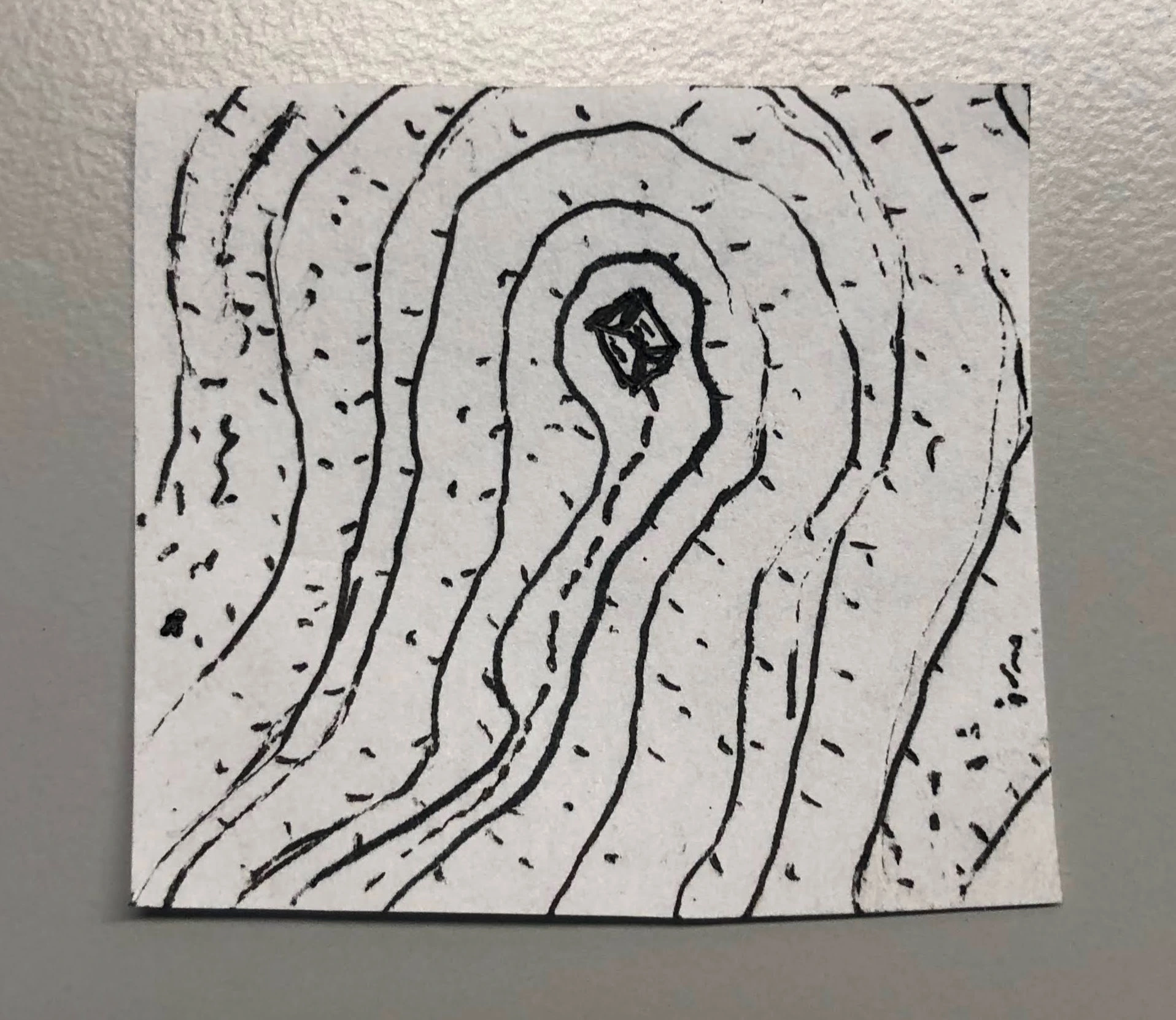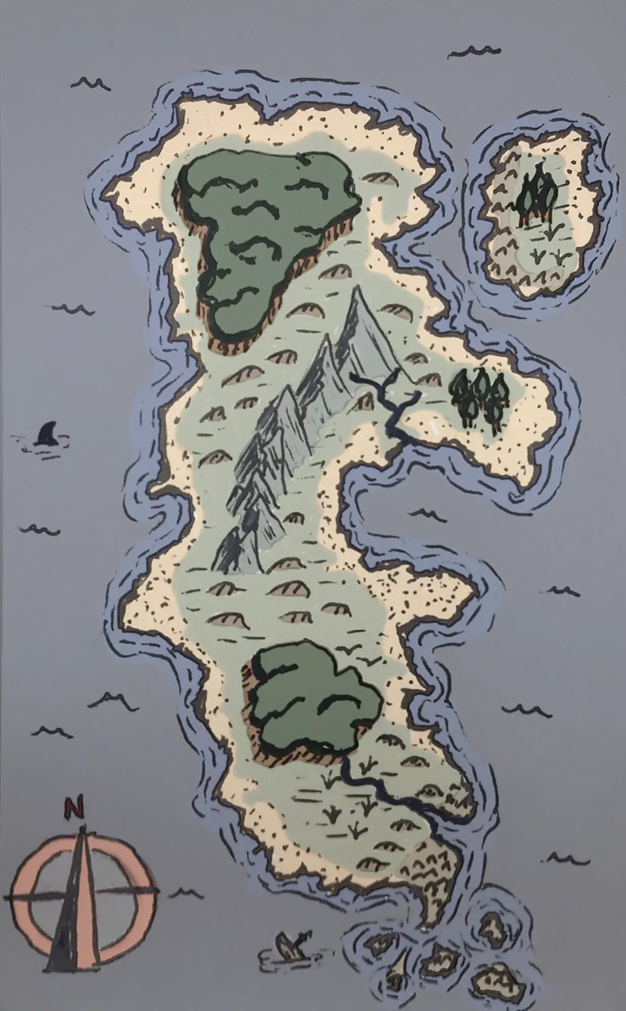

I’ve long thought that portraying elevation in top-down maps is extremely hard.
This is sort of a test.
Nice. Portrait of Metyr, Mother of Fingers
Hmm, this looked like a canyon to me at first blush, was it supposed to be a mountain?
I’m not much of an artist, but I’m an astronomy nerd, which means I’ve seen my fair share of photographed craters. Oftentimes, if the light is shining from the bottom of the image, craters look like mountains and vice-versa. So maybe some extra shading at the top for craters and at the bottom for mountains might help sell the illusion of depth?
Yeah, shading would have helped.
I once read (or maybe watched a video?) saying that most cartographers shade as id the sun were in the upper left of the image. Of course, it’s an artist choice, so many more decide against it. :)
But even if you’re not an astronomy enthusiast, you can open up Google Maps and check out the satellite photo layer. Every now and then, you’ll come across a terrain feature that you can’t easily tell if it’s raised or depressed.