

Original Post
So this is one of my attempts at lighting.
It looks awful.
The skyscrapers here are lighted form inside with a point light, since they are hollow.
I am using a sun light too to make the general scene brighter, its too dim without one.
finally, one spot light that is linked to the humanoid (i.e it only applies to the humanoid) to give the humanoid more highlight.
oh forgot to mention there is a slight fog to dim the background, using a cube with volume scatter
So after following some of your tips and suggestions, I have achieved the following result:
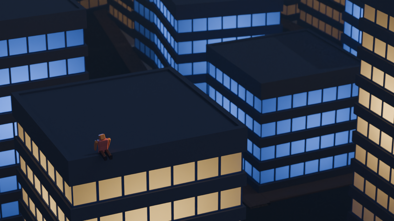
What I did:
- Use an HDRI as a base
- Change sun position to make shadows visible
- lower sun strength
- change the light color of the skyscraper behind the humanoid
- change the highlights position and color to match the skyscrapers around
- modified the fog, increased its visibility and changed its color and density
Although it doesnt look perfect nor great, I am very happy with how it turned out , and that is thanks to everyone here.
I am planning to make more changes, based on the other comments, like that comment that suggested bloom, so expect another update inshallah 😄
Anyway, really like the new render, thank you lemmings 🤍
Use references, watch tutorials, follow them, don’t listen to ppl saying not to do tuts, that advice is for people who have already used the software for yeaes and are stuck only doing tutorials, you’ll only get good following ppl who know what they are doing ans getting good habits initially. I’m trying to hit 1 tut a day right now, still feel way behind from where I want to be 2 years in. If I didn’t do any tuts id be so much further behind, just fiddling with sht cluelessly.
There are more than a few really good yt tuts on making buidings and cities, def check out some on lighting/compositing, I also tried making cities with no reference from scratch without following any tuts when I started.
I think the purpose of light isn’t to light up everything for readability but to grab attention or convey a message:

Here the victims are lighted by one source of light: the lamp. It grabs attention. we can read their faces. The white clothes that reflect a lot of light make the him a martyr or an angel. The shooters are in the shadows, dark and evil. The darkness makes them anonymous. The city is dark. there is no light in windows. It makes the viewer wonder what happened to people in the city. Are they asleep? Did they left? Or Were they killed?
Think of a light as a tool to highlight stuff and darkness to hide stuff.
I will only suggest the absolute basic.
Look at references, lots of them
Find those renders and style that you like. Observe fine details and experiment to reproduce same result. If you don’t understand how to do specific thing, you can always ask around.Use real world scale
If you are not making stylized miniature render, model everything to scale. Same applies to light size and power. If it’s too bright or too dark, fix it with render exposure or compositor.Use HDRI
With Cycles, you get decent lighting in one step. And even though EEVEE resamples light texture down, it still have enough detail that gets you okay-ish lighting faster than multiple light object setup. EEVEE next already have automatic “fake sun” if you want that.Have fun!
Ugh, I hate references but its the only way I will learn how to even do lighting.
HDRIs seem like a good base, but I still need to have some light source to hide/show foreground/background.
As for using real world scales, how do I even manage to do that? and why is it important. Also, how will I know how strong in watt light sources are?
With Cycles, you get decent lighting in one step
I am using cycles, eevee is fast, but needs a proper setup
Either way, Thank you for the advice.
If you don’t go for tutorial/course/workshop route then reference is probably the only way.
The “Item” panel in the right side N-panel shows objects scale and dimensions.
I believe non 1.0 scale have no effect on lighting (it will affect result from modifier) it is still good practice to make it 1.0
Dimensions group will show… dimensions, of the object. Keep it realistic. If you wish to place something in the scene as a reference, someone made an extension for that. It have not pass the approval yet though.
https://extensions.blender.org/approval-queue/autoscale-ref/
I think just knowing and keeping the scale in mind is enough.For lights power, get it from manufacturer website. It is not a strict law and you can get away with some degree of artistic freedom. But be consistent, light from one candle should not be 5 times stronger than other candle.
There are some free extensions that copy “Photographer” add-on which have light presets, lumen or candela conversion all that stuff. Useful quick read
https://docs.blender.org/manual/en/latest/render/lights/light_object.html#power-of-lightsSize affect shadow blurriness. Distance affect how long bright-dark gradient is (falloff) Again, artistic freedom.
From technical standpoint, I think it comes down to knowing what will happen when tweaking certain number. The rest is artistic skill.
Bookmarked, will check it out, thanks. 🤍
As someone else said, use references. But my initial thoughts are that it looks a bit too flat, lighting that looks nice usually has at least some directionality. There aren’t any shadows and a lot of the scene has fairly uniform lighting so possibly having a more intense light visible in the scene could help. If you’re doing a render with a focus try to have some of the light directed to that focus (your little guy on the roof probably).
I think the window glow looks pretty good.
My suggestion is on the compositional side: The lighting on the humanoid lacks a physical source, so the highlight looks out of place as if the figure was composited into the scene separately. If you can think of an object that is casting light onto the humanoid and place it into the scene (a neon sign, light spilling from a rooftop access door, etc) everything would fit together just a bit better.
Another thing you could try is looking into 3-point lighting used in photography and film. Different 3-point configurations on the humanoid could help make them stand out from the background while keeping the highlights more subtle.
Thanks for the advice, I assume searching up “3-point lighting” is what I need to do to understand what it is about.
think of an object that is casting light onto the humanoid and place it into the scene (a neon sign, light spilling from a rooftop access door, etc) everything would fit together just a bit better.
Sure thing
Thank you, again!
I have no advice, but the buildings look very Batman : The Animated Series, and it’s awesome.
I didnt watch it, but thank you!
I think it looks great. Are you using the Properties > Render > Light Paths > Bounces setting? Also, which render technique did you pick? Cycles or Eevee?
Also, which render technique did you pick? Cycles or Eevee?
cycles
Are you using the Properties > Render > Light Paths > Bounces setting
No idea what that is. will check it out I guess.
I think it looks great
Thanks, but… I want it to have a midnight vibe. the render looks flat.
you need line breaks for quoting to work
Its fine?
 will add line breaks anyway
This guide and the rest of his channel is a great way to go from Blender novice to pro
Thanks for the resource, I will check it out!
- Do bad lighting
- Until you’re not
Practice and good sleep makes perfect.
I like to use the sky texture as its really easy to control Alternatively you could mimic it by adding a 2nd lower brightness sun light, turn the angle to 180° and change the colour to blue. This recreates the ambient light effect of the sky in daylight pretty nicely when paired with a lower angle sun light
HDRIs are also a really quick and easy way to get realistic lighting, although it can be tricky to get a sense of scale
Strategically placed glossy and metallic materials will help reflect light around your scene to highlight certain details
Just had another look at your render, I like the lighting on the character! However it is coming from the opposite direction vs your big sun light
Okay will do some tweaking, thanks!
I like to use the sky texture as its really easy to control Alternatively you could mimic it by adding a 2nd lower brightness sun light, turn the angle to 180° and change the colour to blue. This recreates the ambient light effect of the sky in daylight pretty nicely when paired with a lower angle sun light
Will give it a try.
Strategically placed glossy and metallic materials will help reflect light around your scene to highlight certain details
Hmm, I wish I knew where to place them. I have no idea how to make use of reflecting light
Anyway, thank you!
This looks pretty cool already!
You could give the windows an emissive texture, if you want to make it look more “realistic” or so. And add some fog to the scene. It’s expensive to render, but may make it look nicer. Also check how to give the lights a “glow” around them.
As sibbo said, the windows might look nice with some glow, often called “bloom”
But how do I apply it? using an emissive material just makes the lightning seem flat and increases the brightness of the entire scene.
Or did you mean something else?
- Compositing tab on top
- “New” in center top of the bottom panel
- Shift+A for add, search for Bloom (subtype of Glare node)
- Place it between the two default nodes
You could also try some of the other Glare subtypes, some are more subtle or extreme
Note that it is a bit of a trick/shortcut; you could probably achieve the the same effect with more realistic directionality just fine tuning lights and fog, but it would take a lot more tweaking of settings.
Bloom is useful for tricking people into thinking an object is bright or light-emitting. The more bloom, the brighter an object appears to be.






![[UPDATE #1] How do I get good at lighting](https://media.piefed.social/posts/yN/wU/yNwU1JvRQiyrcKY.png)