
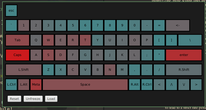
Have you ever wondered if your keyboard shortcuts are set up optimally? Well, I did, so I decided to visualize it with a heat-map.
It proved to me that I rely on my left pinky too much, so I’ll try to rework my shortcuts.
You can check out the project here, currently it only works on Linux.
You must log in or register to comment.
what are you doing with your caps lock key?
I assume the red is the least used.
Yeah I suppose that would make more sense. Although using red to indicate least used on a heat-map seems like a poor choice
