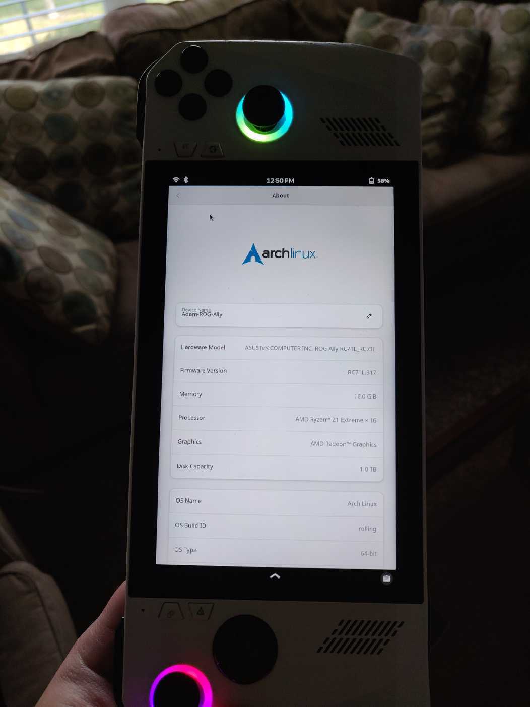
I installed Phosh on my ROG Ally with Arch. It’s surprisingly good for that purpose. Squeekboard is the best onscreen keyboard for Linux that I’ve used, at least when you add in custom configuration files. The only issue for this use case is that phoc doesn’t support variable refresh rate displays (to be fair, neither does GNOME’s mutter, but there’s a modified mutter-vrr package on AUR that does). If phoc supported VRR then it would be great for gaming handhelds. Squeekboard’s integration is much better than the Steam Deck keyboard on KDE.
Here’s what that looks like, in portrait mode it works like a tablet. Have to do screen rotation via the toggle in notification area or settings as gyro doesn’t work for rotation.

I never thought of installing a mobile linux distro on that; interesting choice.
Does it work for gaming/phone things?
Not as well as I would’ve liked, I ended up going back to Plasma on it. It works wonderfully for touchscreen computing, such as browsing and using desktop apps without a mouse and keyboard, but gaming doesn’t work well on it mainly due to the lack of VRR support on Phosh/Phoc.
It would be a nice feature, if Phosh behaved a bit different in landscape mode; it wastes too much vertical space, especially using Firefox to browse the web is a disaster. Maybe the top and bottom panel should share screen space at the top instead (each half of the screen); or they should be on the sides instead…
Yeah, it needs a way to hide the bottom bar at least. The bottom bar is even more useless than the Android navigation bar, which is also a colossal waste of screen real estate. I despised the move away from physical buttons on Android, but I think they’ve since made up for it since they implemented gesture navigation which does away with the screen-wasting bar. Phosh’s bar is just a single action except for the keyboard button, and the keyboard button is the absolute worst. Tiny button squeezed in the very corner on a mobile UI that runs on phones that frequently have rounded edges that cut off things in the very corner. That whole design needs reworked IMO. Gesture option would be amazing.


